基 本 書 体 的 可 能 性
正在写的新书里的一篇文章,关于基本书体的可能性。汉字经典书体,即楷体、宋体、黑体、仿宋体。我常选由铅活字时代演变而来的、经过时间检验的、名家完成的经典书体。正体字过于平和统一无特点,但也意味着结构稳定中正而且可能性很多,需要打破平和、增加特点。但又不可多,因为既然选择正体字即是偏向于不花哨的风格;要巧妙,点到为止,但又点石成金。
POSSIBILITIES OF BASIC TYPEFACES
This is an article of my new book about possibilities of basic typefaces. The Chinese classic typefaces include Kai, Song, Hei, Fang Song. Because of the steady structure, there are many possibilities to different design cases. What it needs is breaking the steady and release the possibilities, but it's just softly touched and turned into gold from stones.
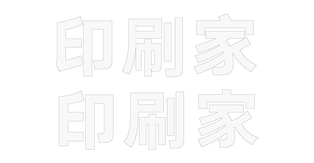
印 刷 家
Print Home
1

The font "汉仪旗黑85S" is selected as the basic of the Chinese logotype.
The joints of the strokes are separated in order to display clearly on the website.
凉
Cool
2
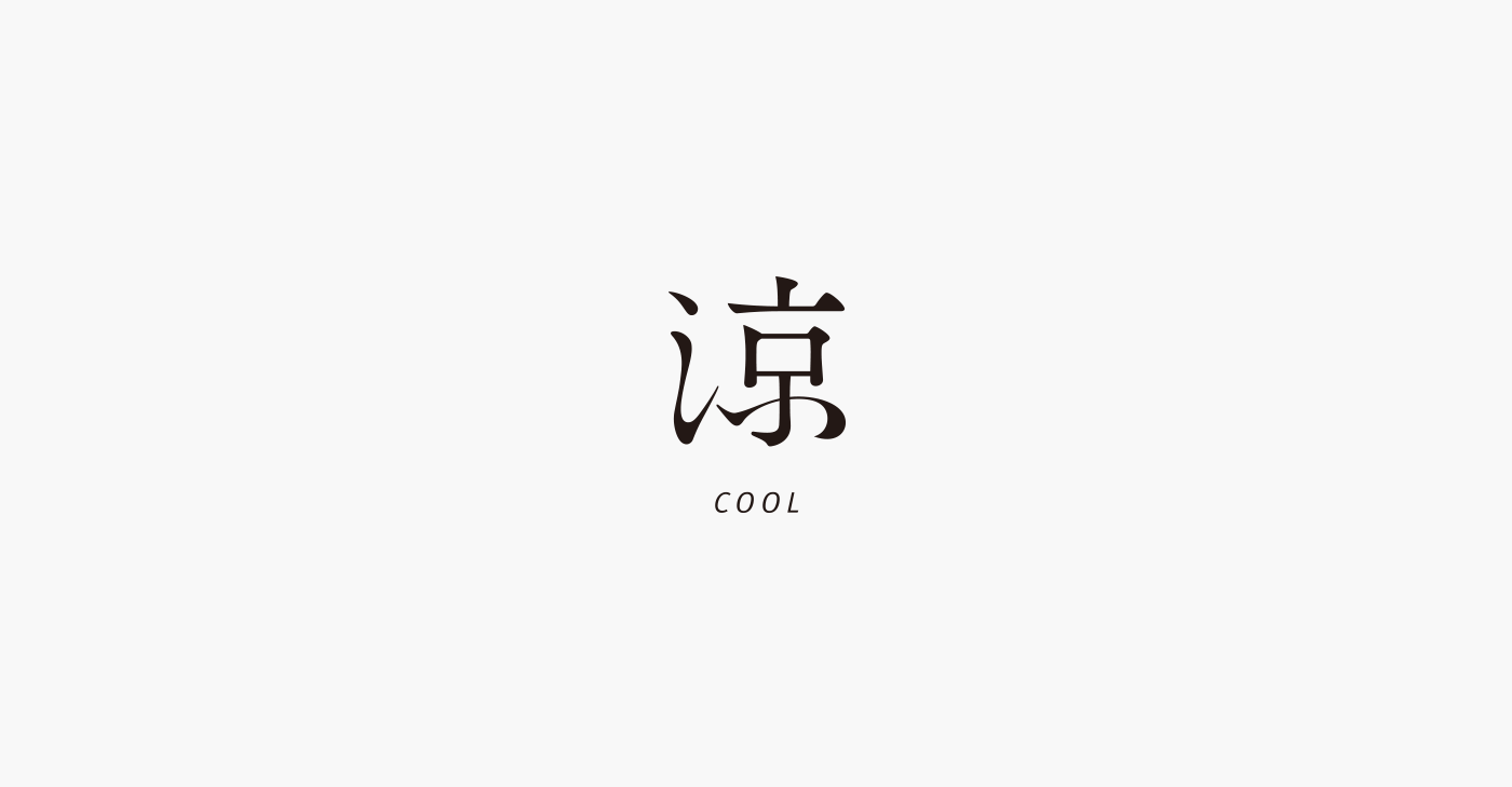
"涼" is based on the font "筑紫オールド明朝"
and used Chinese calligrapher Zhengmeng Wen's and Mengfu Zhao's cursive script for reference.

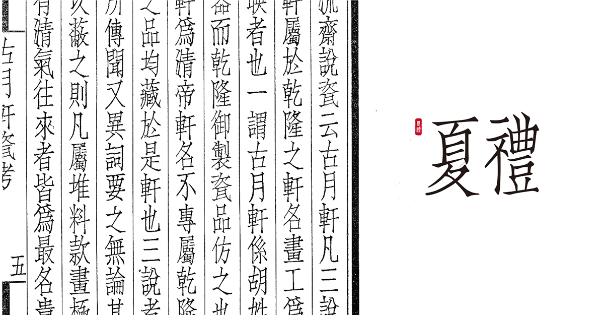
夏 禮
Gifts of Xia
3

"夏禮" is based on Ju Zhen Fang Song named "聚珍仿宋"
which is carved to print poems in the Republic of China.
青 棵
Pine Cafe
4
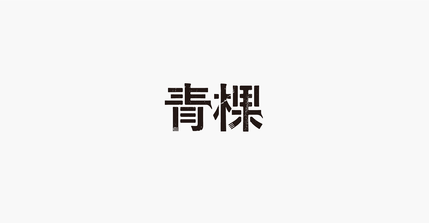
"青棵" is based on the font "游ゴシック体" the strokes of which are not smooth and featured by writing tools' details.
It's added Tibetan and highland barley style in the end of the strokes.

美 若
Mirror
5
Mirror
5
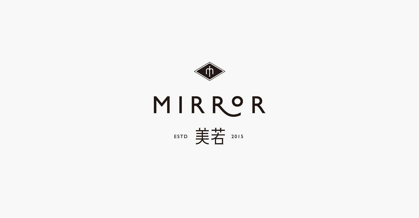
"Mirror" is based on the classic font "Gill Sans". The logomark is inspired by mirrored "M".

There are so much intelligences and theories in the classic fonts that we can't change them easily without respect.
The tail of "R" is extended and "O" is changed to smaller one.

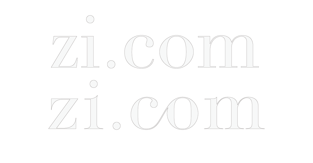
字 里 行 间
zi.com
6

"zi.com" is based on the font "Didot" looking like the Chinese logotype style.
Reducing the hair line, adjusting the shape into geometry style, adding the joint between "c" and "o".
T.B.
tballer brand
7
tballer brand
7
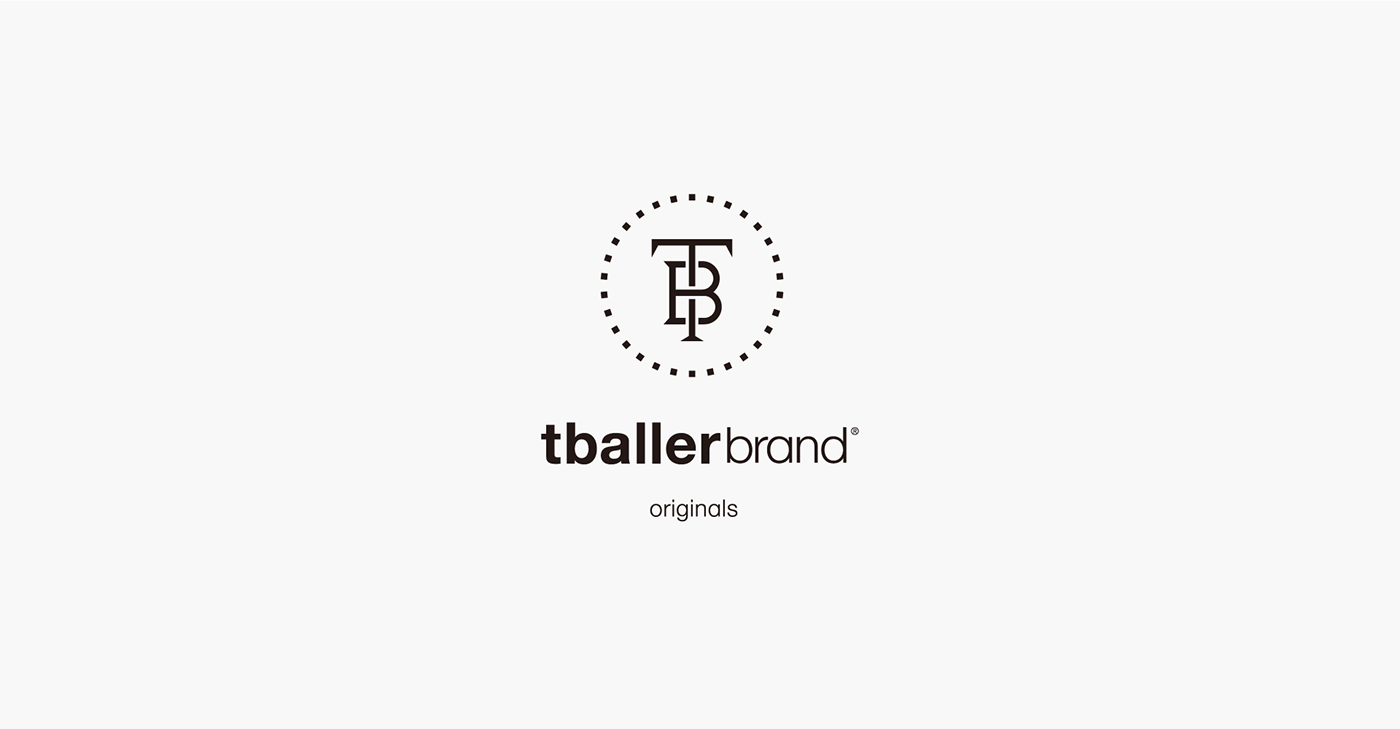
"tballer brand" is based on the font "Helvetica".
Changing the 2 level"a" into 1level "a", adjusting the curve of "b", "a", "n", and "d" into geometry style.
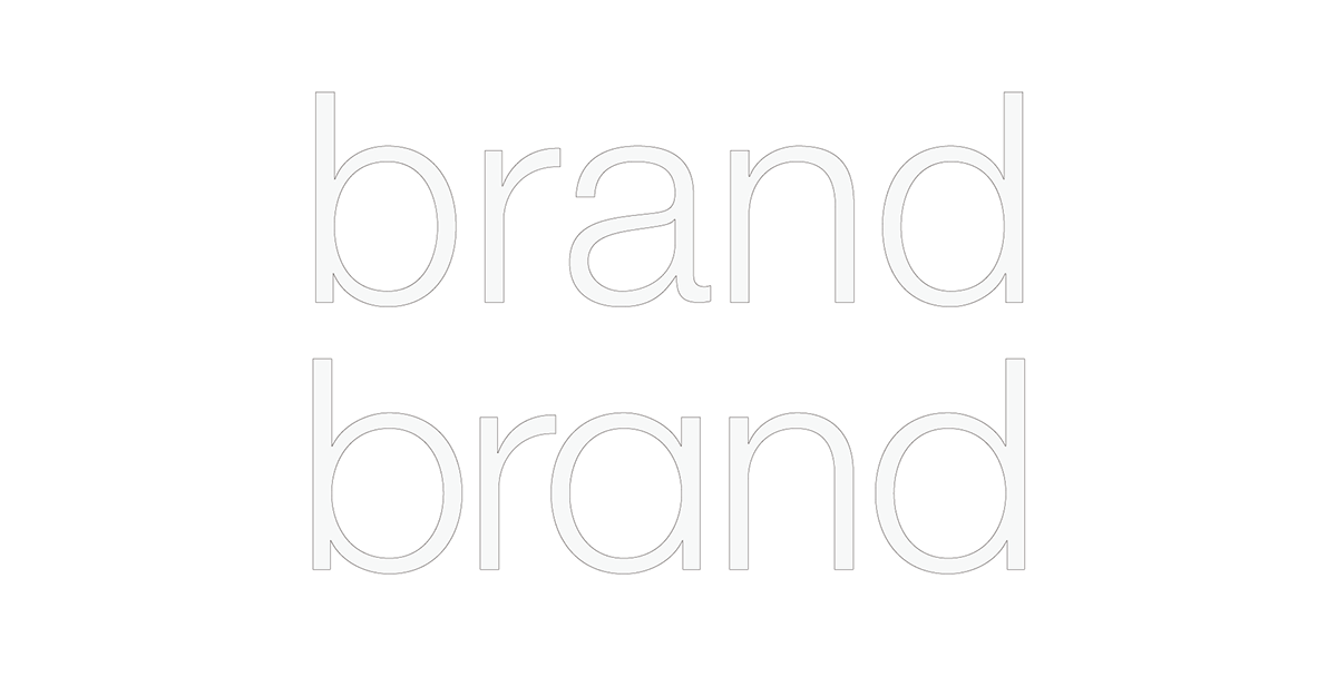
Increasing the letter space of "tballer" and the baseline of "brand",
decreasing the letter space and ascender line of "brand".

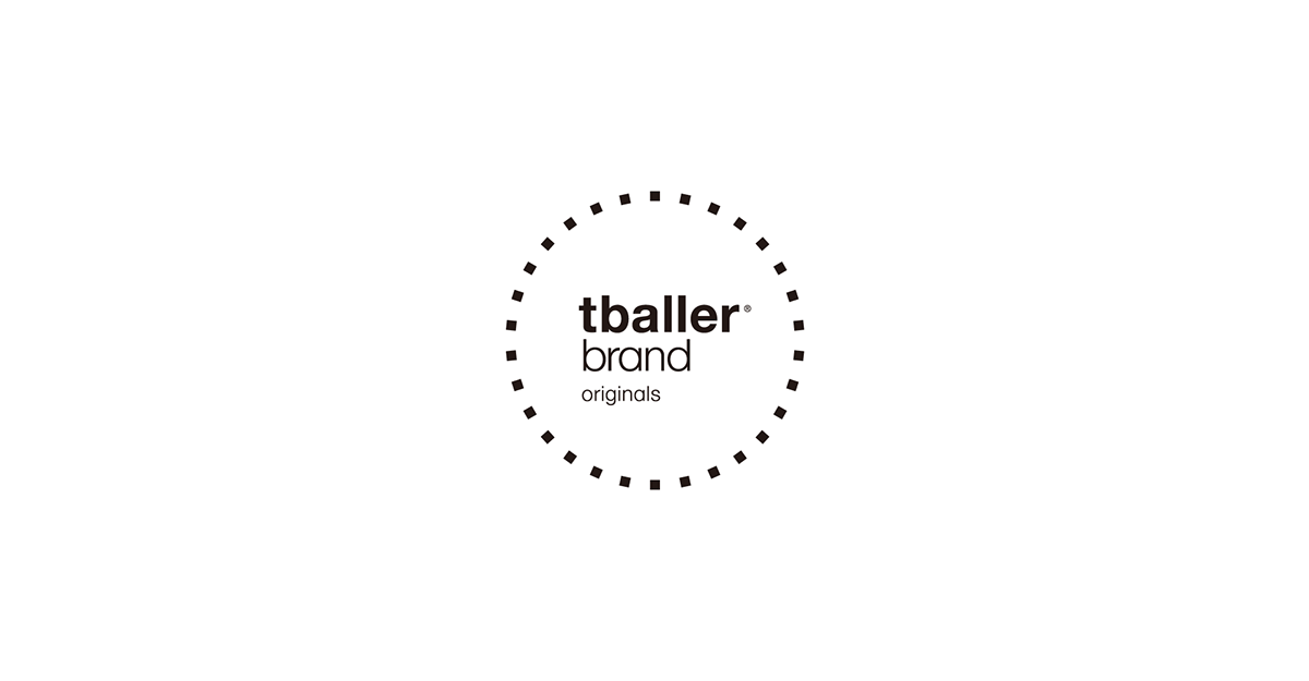
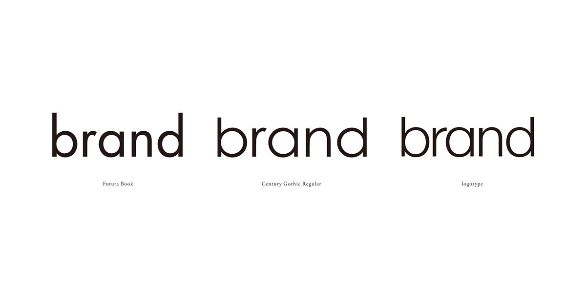
Why don't you just select the geometry style fonts like "Futura" and "Century Gothic" ?
It's a janpese street fashion style brand, so even it's geomtry style the curves are soft and humanistic,
not rational and industrial style like "Futura" and "Century Gothic" .
Feel the differences of the curves below.
微信公众号/Wechat: archerzuostudio
新书发布时间/Time of new book publishing: Autumn of 2016


